Email or username:

Password:

Forgot your password?
10 posts total
Nina Kalinina

~Project Orihime: buttons and system font~

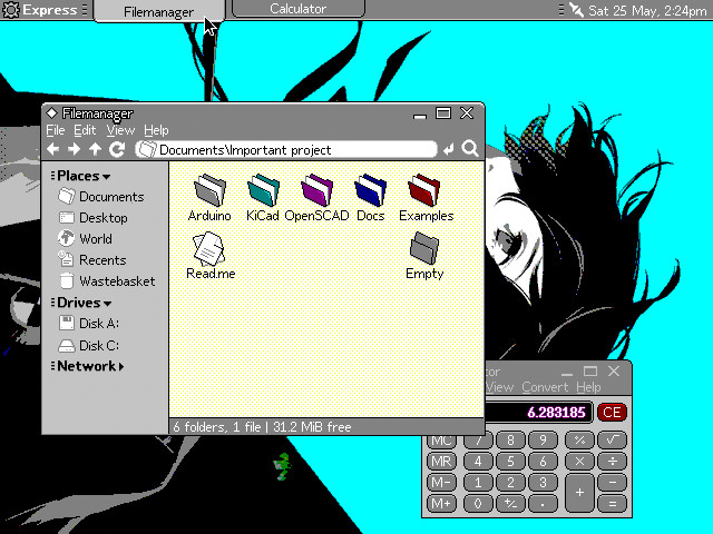
Project Orihime is a concept of a modern user interface for EGA and VGA displays running in 16 colours, aimed primarily at FreeGEOS.

The goal here is to bring an eye-candy interface and good UX to the 1984 IBM PC clones.

This is not a real UI (yet), but it gets more and more fleshed out, and I think it looks great on both CRTs and LCDs of the era.

I want to try and document some of my progress for your enjoyment. It also helps me to make better sense of design decisions I am taking on the go. Thread!

🧵 1/10

~Project Orihime: buttons and system font~

Project Orihime is a concept of a modern user interface for EGA and VGA displays running in 16 colours, aimed primarily at FreeGEOS.

The goal here is to bring an eye-candy interface and good UX to the 1984 IBM PC clones.

This is not a real UI (yet), but it gets more and more fleshed out, and I think it looks great on both CRTs and LCDs of the era.

Nina Kalinina

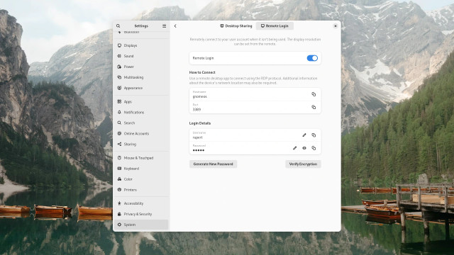
For those of you who never thought about old computers and modern interfaces, I want to remind you that "simple" and "flat" interfaces of modern operating systems rely on high resolutions and 24-bit colours a lot.

Take Gnome 46, for example.

1920x1080 in VGA palette looks somewhat okay, but

640x480 in modern 24-bit colour looks like it's losing quite a lot of details, and

640x480x4bpp VGA 16 of the said interface is simply unusable. Perhaps this is why modern OSes demand at least 800x600 in True colour.

So, uh, do you know what you usually end up when you try to make your interfaces look OK in default palette and resolutions of 640x350 or 640x480?

🧵 2/10

For those of you who never thought about old computers and modern interfaces, I want to remind you that "simple" and "flat" interfaces of modern operating systems rely on high resolutions and 24-bit colours a lot.

Take Gnome 46, for example.

1920x1080 in VGA palette looks somewhat okay, but

640x480 in modern 24-bit colour looks like it's losing quite a lot of details, and

Nina Kalinina

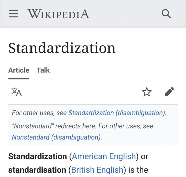
Wikipedia:

Cargo cult programming. See also: GitHub Copilot

Shane Celis

@nina_kali_nina Ha ha ha!

GOOGLE: We’ve automated your nightmares. You’re welcome.

Nina Kalinina

That's all you need to know about "standardization" IRL

Show previous comments
xs4me2

@nina_kali_nina

The good thing about standards is that there are so many that each can have his or her own ;)

Jan Niklas Fingerle

@nina_kali_nina
You won't believe it, but in German and French it's another two totally different words.

Nina Kalinina

~Project Orihime: Windows~

Arguably, the most important abstraction of any windowing system is a window. And in most windowing systems, the most important part is the title bar.

Let's say we want to make a windowing system that will look nice and modern while working in 640x480 16 colours mode. It shouldn't be too much of a challenge, because modern windowing systems are all using simple flat colours instead of gradients or textures that used to be popular just a decade ago, right?

Let's start with drawing a window title bar like that, and then compare it with popular modern systems.

Huh! It is missing something... But what?

🧵 1/6

~Project Orihime: Windows~

Arguably, the most important abstraction of any windowing system is a window. And in most windowing systems, the most important part is the title bar.

Let's say we want to make a windowing system that will look nice and modern while working in 640x480 16 colours mode. It shouldn't be too much of a challenge, because modern windowing systems are all using simple flat colours instead of gradients or textures that used to be popular just a decade ago, right?

Nina Kalinina

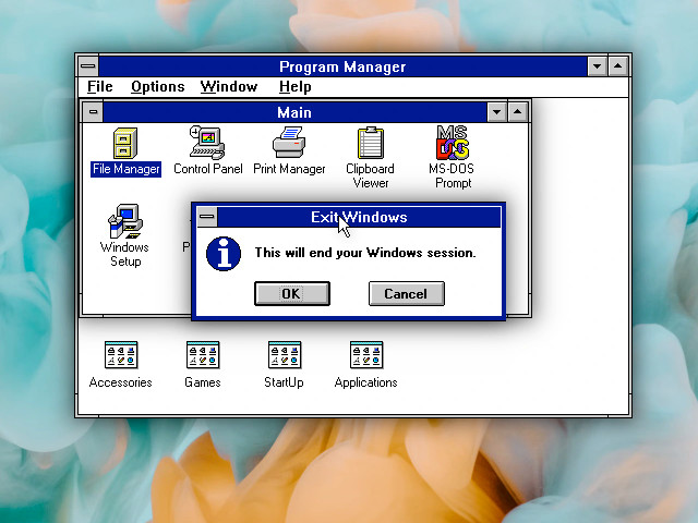
The oomph that all the modern systems have and old systems don't is drop shadows.

Just take a look at this doctored screenshot of Windows 3.1 with drop shadows from each window. Just look at it, darn.

Simply drawing a rectangle and adding a drop shadow from it almost automatically makes us feel like this is a "window" and it is "floating" on top of other windows.

But 16 or 256 colour interfaces cannot afford this. Project Orihime _has_ to have a sharp boundary between the window frame and elements below. The screen resolution is too low, and the palette is too small to allow for that.

But it still looks noticeably more modern than Motif windows, due to 1-pixel window border (as opposed to 4-10 pixel wide borders), and rounded corners with a gradient. Wait, what, 10 pixel wide window borders? Who ever thought this was a good idea? Show me the designer of these interfaces!

🧵 2/6

The oomph that all the modern systems have and old systems don't is drop shadows.

Just take a look at this doctored screenshot of Windows 3.1 with drop shadows from each window. Just look at it, darn.

Simply drawing a rectangle and adding a drop shadow from it almost automatically makes us feel like this is a "window" and it is "floating" on top of other windows.

Nina Kalinina

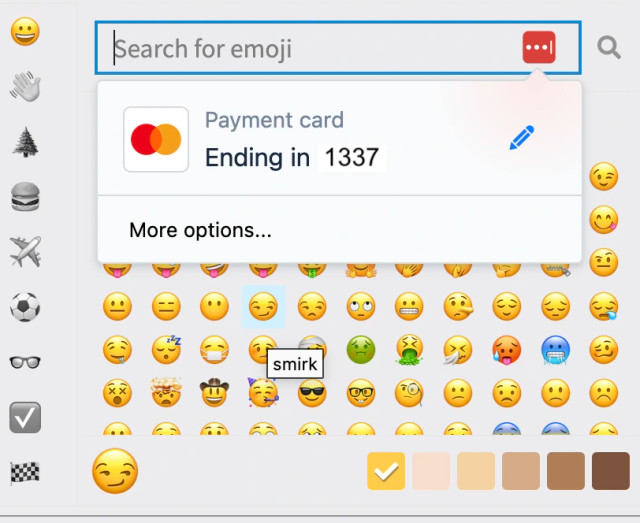
My eyes are full of tears and I don't know whether it's because I'm reading How Do We Relationship 10 or because I'm reading How Do We Relationship 10. It's so relatable 😭

Nina Kalinina

I love semantic HTML. Each input field is so easy to describe in a sensible way. It can even be used by plugins and user-scripts.

Show previous comments
RC2014

@nina_kali_nina
That's why I use ROFL emoji whenever I am asked for payment info 😂

Laker Turner

@nina_kali_nina the amount of times i've almost accepted this on stream/screenshare is.... more than once

Nina Kalinina

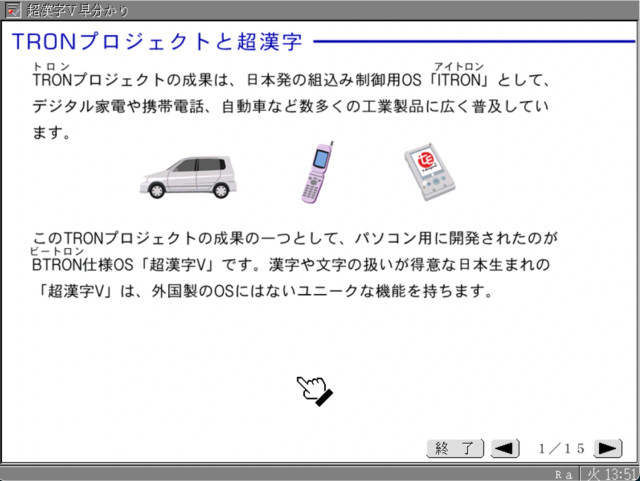
What if I told you there is an immensely popular operating system that you likely used it at least once, but did not realise what it was?

In fact, it is so popular and important there is an IEEE standard based on it.

It is uncanny how immensely popular AND immensely obscure this system is.

It is scary that until today I have never even heard of its reference desktop implementation.

The system is called "TRON".

🧵 thread~

p.s. thanks @fkinoshita for the pointer!

Show previous comments
Kirtai

@nina_kali_nina I knew about TRON but didn't know there was a desktop version.

Also, the kitties and wait cursor are adorable.

lproven

@nina_kali_nina @fkinoshita @thomholwerda

There was a video demo at the Chaos Computer Congress a couple of years ago:

media.ccc.de/v/rc3-525180-what

It was widely discussed at the time, e.g.
news.ycombinator.com/item?id=3

I knew of TRON and iTRON but this was the first time I saw video.

Although I know a few words of Nihongo, I can't read worth a damn, so I can't try it for myself. This makes me sad.

Nina Kalinina

Logographic languages seem to encourage understanding of words' etymology more than alphabetic or syllabic languages, at least to me. Beyond obvious things (三for 3), there's cute things like 鳥 bird and 烏 crow as a bird whose eyes you can't see. And beyond cute things, there are great cultural things, like 大金星 -"big golden planet" meaning "surprising stunning victory". I have no idea whether young Japanese people know why the word is what it is, but older generation probably understands the reference. In sumo matches, the table of games is originally written as ◯◯◯. Losses then are marked as ●●. Thus, victories are "white planets" and defeats are "black planets". If you want to specify that someone had an impressive victory, you'd mark the planet with gold - 🪙. Only wrestlers from lower ranks could get "golden planet". If a low ranking newbie fought a legendary sumoist and won, that'd be "big golden planet". It is even an official term in sumo! 😍

Logographic languages seem to encourage understanding of words' etymology more than alphabetic or syllabic languages, at least to me. Beyond obvious things (三for 3), there's cute things like 鳥 bird and 烏 crow as a bird whose eyes you can't see. And beyond cute things, there are great cultural things, like 大金星 -"big golden planet" meaning "surprising stunning victory". I have no idea whether young Japanese people know why the word is what it is, but older generation probably understands the reference....

Show previous comments
Thankful Machine

@nina_kali_nina I wonder if most people just think “dot”. In English we have “stars” and “asterisks”, gold stars, etc... I don’t know if I think about celestial bodies much when I see these usages but maybe I should!

Great job on the exam you get an iridescent supernova

gábor ugray

@nina_kali_nina Tiniest of tiny nits to pick (and sorry!). It's not the language that's logographic, "just" the writing system. Eg Chinese can be written in Pinyin and it stays the same language. But it's true that the writing system adds a whole layer of parallel semantics for the speakers of C&J who are literate, and this is deeply culturally embedded!

Nina Kalinina

In the aftermath of CollapseOS email list drama, I wrote a note about healthy conversations in diverse communities:
ninakalinina.com/notes/conv.ht

I tried to summarise the things about the topic that I've learned in the last few years. Maybe they will be helpful for you, too.

Nina Kalinina

IPCC and the countries that kill us all in this Twitter thread: twitter.com/NiranjanAjit/statu

ben🎃ui

@nina_kali_nina very surprised Canada didn't have their hands in trying to obfuscate the problem

:gay: zetta :transknife:

@nina_kali_nina this is so depressing. i'm not really looking forward to updating plaintextipcc.com 😞

Go Up