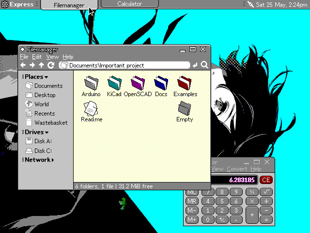
~Project Orihime: buttons and system font~
Project Orihime is a concept of a modern user interface for EGA and VGA displays running in 16 colours, aimed primarily at FreeGEOS.
The goal here is to bring an eye-candy interface and good UX to the 1984 IBM PC clones.
This is not a real UI (yet), but it gets more and more fleshed out, and I think it looks great on both CRTs and LCDs of the era.
I want to try and document some of my progress for your enjoyment. It also helps me to make better sense of design decisions I am taking on the go. Thread!
🧵 1/10


For those of you who never thought about old computers and modern interfaces, I want to remind you that "simple" and "flat" interfaces of modern operating systems rely on high resolutions and 24-bit colours a lot.
Take Gnome 46, for example.
1920x1080 in VGA palette looks somewhat okay, but
640x480 in modern 24-bit colour looks like it's losing quite a lot of details, and
640x480x4bpp VGA 16 of the said interface is simply unusable. Perhaps this is why modern OSes demand at least 800x600 in True colour.
So, uh, do you know what you usually end up when you try to make your interfaces look OK in default palette and resolutions of 640x350 or 640x480?
🧵 2/10
For those of you who never thought about old computers and modern interfaces, I want to remind you that "simple" and "flat" interfaces of modern operating systems rely on high resolutions and 24-bit colours a lot.
Take Gnome 46, for example.
1920x1080 in VGA palette looks somewhat okay, but
640x480 in modern 24-bit colour looks like it's losing quite a lot of details, and