Email or username:

Password:

Forgot your password?
Nina Kalinina

~Project Orihime: Windows~

Arguably, the most important abstraction of any windowing system is a window. And in most windowing systems, the most important part is the title bar.

Let's say we want to make a windowing system that will look nice and modern while working in 640x480 16 colours mode. It shouldn't be too much of a challenge, because modern windowing systems are all using simple flat colours instead of gradients or textures that used to be popular just a decade ago, right?

Let's start with drawing a window title bar like that, and then compare it with popular modern systems.

Huh! It is missing something... But what?

🧡 1/6

15 comments
Nina Kalinina

@luana Project Orihime is my attempt at making a modern user interface for 640x480x4bpp GEOS, so IBM PC XT could look sleek and modern

Nina Kalinina

The oomph that all the modern systems have and old systems don't is drop shadows.

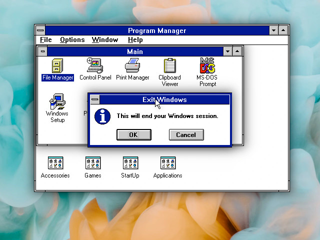
Just take a look at this doctored screenshot of Windows 3.1 with drop shadows from each window. Just look at it, darn.

Simply drawing a rectangle and adding a drop shadow from it almost automatically makes us feel like this is a "window" and it is "floating" on top of other windows.

But 16 or 256 colour interfaces cannot afford this. Project Orihime _has_ to have a sharp boundary between the window frame and elements below. The screen resolution is too low, and the palette is too small to allow for that.

But it still looks noticeably more modern than Motif windows, due to 1-pixel window border (as opposed to 4-10 pixel wide borders), and rounded corners with a gradient. Wait, what, 10 pixel wide window borders? Who ever thought this was a good idea? Show me the designer of these interfaces!

🧡 2/6

The oomph that all the modern systems have and old systems don't is drop shadows.

Just take a look at this doctored screenshot of Windows 3.1 with drop shadows from each window. Just look at it, darn.

Simply drawing a rectangle and adding a drop shadow from it almost automatically makes us feel like this is a "window" and it is "floating" on top of other windows.

Nina Kalinina

The thing is, 30 years ago wide window borders probably were a good idea. When you realise that, you probably will want to look back at previous systems and see how "windows" have evolved over time, what did they gain and what did they lose over time.

One of the earliest windowing systems, Xerox Star, did not offer any built-in chrome or buttons for the windows. If the programmer did not add "close" button, there was no way to close the window. I don't have an emulator at hand, but I think windows were not resizeable either.

Apple mostly copied that into Lisa, but added two important things in 1984's Mac: "close" button and "resize" button. And yes, you cannot resize the window by dragging its boundaries. Only resize button.

Makers of Amiga Workbench (and GEM) added buttons for quick resizing of the windows.

NeXTSTEP from 1988 was seemingly the first one to use "X" icon to close windows. It still had "resize" button to resize the windows arbitrarily.

🧡 3/6

The thing is, 30 years ago wide window borders probably were a good idea. When you realise that, you probably will want to look back at previous systems and see how "windows" have evolved over time, what did they gain and what did they lose over time.

One of the earliest windowing systems, Xerox Star, did not offer any built-in chrome or buttons for the windows. If the programmer did not add "close" button, there was no way to close the window. I don't have an emulator at hand, but I think windows...

Mia Rose Winter :v_greyace:​

@nina_kali_nina speaking as a 2-in-1 laptop user

I hate apps that make the title bar way too small, as well as the buttons on it, it's nearly impossible to properly grab them with touch, I hate it

Colman Reilly

@nina_kali_nina Motif looked pretty clumsy even 30 years ago.

Nina Kalinina

So, when Microsoft Motif style became an industry standard, it only made sense to visually indicate that the windows can be resized by dragging the boundaries of them.

By the time Windows 95 and BeOS were released, it became a common knowledge. Sometimes you could still find visual hints of "this window can be resized" in the corners of windows. But most systems just removed the hints from the UI.

The number, order, position and iconography of title bar buttons has never stopped evolving. At some point, Mac had four buttons - and modern Windows still has four buttons too, one of them mimics as a window icon.

What are the title bar buttons? Close, minimize, maximize, collapse into titlebar, resize, pin, always on top, window menu. Pick one or more!

Finally, some systems have experimented with vertical title bar. It looks fancy, but it means the name on the title bar is going to be vertical, so it's harder to read.

🧡 4/6

So, when Microsoft Motif style became an industry standard, it only made sense to visually indicate that the windows can be resized by dragging the boundaries of them.

By the time Windows 95 and BeOS were released, it became a common knowledge. Sometimes you could still find visual hints of "this window can be resized" in the corners of windows. But most systems just removed the hints from the UI.

PulkoMandy

@nina_kali_nina your BeOS screenshot is cut off. The hint that a window is resizable is not in the titlebar, but at the bottom right. There is either a full resize knob (as in early mac os), or, if the app really needs to draw something in that corner, there are some markings in the window border (otherwise the border is continuous or even entirely missing)

Nina Kalinina

With some history lessons learned, let's try to move some pixels around!

Having only two shades of grey, I figured the lighter will work as "active window" and darker as "inactive window".

When working with resolutions as small as 640x480, you very quickly notice the importance of each pixel. After moving lots and lots of pixels around, I found a way to make windows look smoother and thinner, with no "pixel comb" on the sides.

Shortly after, while working on design for buttons, I realised that the best button style needs to use "dark grey" for the button face. That means active window has to be dark grey, too! That means that inactive window must be one shade darker, or black... But that looks ugly, so I had to find a different way to make it look "unattractive". No gradients, and darker font it is, then.

One of the most important interface aspects is a font. Replacing a random pixel font with a hand-crafted interface-aimed font makes it look less like a concept and more like a real OS.

🧡 5/6

With some history lessons learned, let's try to move some pixels around!

Having only two shades of grey, I figured the lighter will work as "active window" and darker as "inactive window".

When working with resolutions as small as 640x480, you very quickly notice the importance of each pixel. After moving lots and lots of pixels around, I found a way to make windows look smoother and thinner, with no "pixel comb" on the sides.

Hippo πŸ‰

@nina_kali_nina was looking for the rest of the thread and then realised that OHHH I'm actually looking at a thread live, while it's being composed!! 🀯 🧡

Go Up