The oomph that all the modern systems have and old systems don't is drop shadows.
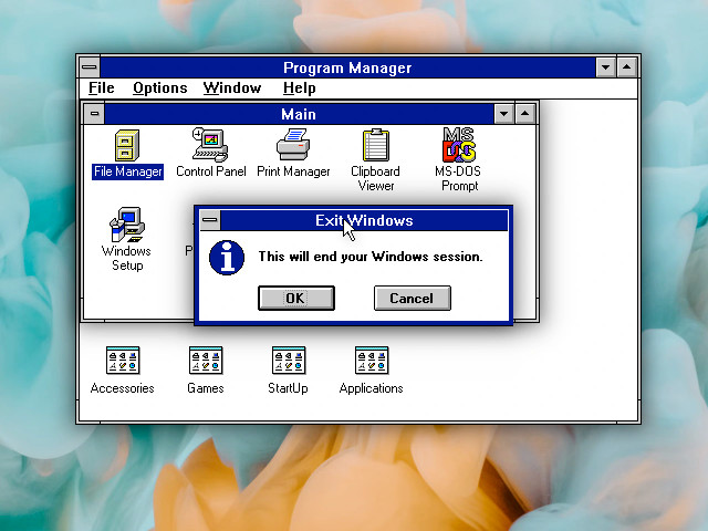
Just take a look at this doctored screenshot of Windows 3.1 with drop shadows from each window. Just look at it, darn.
Simply drawing a rectangle and adding a drop shadow from it almost automatically makes us feel like this is a "window" and it is "floating" on top of other windows.
But 16 or 256 colour interfaces cannot afford this. Project Orihime _has_ to have a sharp boundary between the window frame and elements below. The screen resolution is too low, and the palette is too small to allow for that.
But it still looks noticeably more modern than Motif windows, due to 1-pixel window border (as opposed to 4-10 pixel wide borders), and rounded corners with a gradient. Wait, what, 10 pixel wide window borders? Who ever thought this was a good idea? Show me the designer of these interfaces!
🧵 2/6


The thing is, 30 years ago wide window borders probably were a good idea. When you realise that, you probably will want to look back at previous systems and see how "windows" have evolved over time, what did they gain and what did they lose over time.
One of the earliest windowing systems, Xerox Star, did not offer any built-in chrome or buttons for the windows. If the programmer did not add "close" button, there was no way to close the window. I don't have an emulator at hand, but I think windows were not resizeable either.
Apple mostly copied that into Lisa, but added two important things in 1984's Mac: "close" button and "resize" button. And yes, you cannot resize the window by dragging its boundaries. Only resize button.
Makers of Amiga Workbench (and GEM) added buttons for quick resizing of the windows.
NeXTSTEP from 1988 was seemingly the first one to use "X" icon to close windows. It still had "resize" button to resize the windows arbitrarily.
🧵 3/6
The thing is, 30 years ago wide window borders probably were a good idea. When you realise that, you probably will want to look back at previous systems and see how "windows" have evolved over time, what did they gain and what did they lose over time.
One of the earliest windowing systems, Xerox Star, did not offer any built-in chrome or buttons for the windows. If the programmer did not add "close" button, there was no way to close the window. I don't have an emulator at hand, but I think windows...