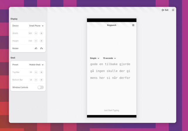
Libadwaita's new adaptive testing feature has motivated me to finally fix Keypunch's mobile layout! The configuration dropdowns are now moved down to the text view on narrow screen sizes. It was pretty easy to accomplish with the new multi-layout widgetry. Amazing how far we've come on the adaptivity road now.
|
12 posts total
Currently adding these sections to about windows of some popular apps whose developers I know have multiple well-known projects. My hope is that these people get inspired to replicate the change to the listed apps as well 🙂
Show previous comments
I haven't yet looked at how that works. Is it just a link to flathub or git page or something else? @bragefuglseth this is great! Maybe you could add an example to Workbench to give this idea to more dev! @bragefuglseth honestly, I'm not a fan of cluttering the about dialog with ads I didn't ask for. This should be a GNOME Software thing to do. Maybe a simple "More apps from … [^]" button can be enough? One of the most important lessons in volunteer-driven development is that motivation isn’t commutable. If a contributor hadn’t worked on thing Y, that doesn’t automatically mean that they would have dedicated their time to thing Z instead. @bragefuglseth This is one of the most annoying things I see in discussions about forks or alternative software, as an example if COSMIC didn't exist then those developers could spend there time contributing to GNOME or KDE, but that's not how this has ever worked. It seems like some people want to treat the whole FOSS world as one company where if you didn't work on one thing then you'd be shifted over to the team working on this other thing.
Show previous comments
@bragefuglseth @Tuba @GeopJr Also forgot to ask, how on earth do you mute or block someone in Tuba? If there is a way I am sure not seeing it. @bragefuglseth @Tuba @GeopJr i absolutely love the omori preview, that is awsum also thanks for supporting aarch64!! :neocat_3c: Attention, developers! My inner perfectionist just noticed that the #Flathub download badge has been subtly improved, but many repositories are still using the old design. Let's fix this! Make sure that your READMEs and websites are rocking the latest design from https://flathub.org/badges. It's not much, but it will let me sleep peacefully at night again!
Show previous comments
@bragefuglseth "Get it on Flathub". Isn't that encouraging promiscuity? Seriously, the former is less ambiguous and unlikely to cause anyone offence. 😉 @bragefuglseth maybe the one at the old URL should be replaced with the new one as well, so it gets automatically update for everyone that used that address? How fast can you type? Find out with my new app, Keypunch! I've worked on this for the last couple of months, and it's finally out. Keypunch lets you practice your typing skills with automatically generated pseudo-text in your language of choice. Alternatively, you can supply it with your own text, such as song lyrics, Wikipedia articles, and quotes. Get ready to accelerate your typing speed! Get it on Flathub: https://flathub.org/apps/dev.bragefuglseth.Keypunch
Show previous comments
I'd like to thank @gregorni, @vixalientoots, and Ibrahim Muhammad for helping me with quality checking the internationalized text generation so far. Ibrahim has patiently tested my various iterations of the text widgetry to ensure that it handles Arabic text properly. I'd also like to thank @sophie for pointing me in the right direction when building the text widgetry, and for helping me get started with libadwaita's animation framework. You're all wonderful people! 🥰 @bragefuglseth Great news: Thanks to recent @flathub changes, adaptive Flathub apps are now actually shown as that in GNOME Software! Previously they were all marked as desktop-only. You'll start seeing this more and more as apps update 😁️ @bragefuglseth @flathub Finally! It was really unsatisfying seeing my app marked as desktop-only when it was fully adaptive 😆 Spotify has gotten an update to its desktop UI, and I'm once again going to argue that it would look so much better on a general basis if it used an integrated header bar on Linux systems. The app is practically begging for it. Are you developing an app for #GNOME? Do you want a nice-looking app icon for it? Now it's super easy to request one. Just create an account on the GNOME GitLab instance and open an issue in our brand new App Icon Requests repository! Tip: If you put a little effort into pitching your app we might get to it quicker 😉️ |


@bragefuglseth yeah, this is really nice and such an improvement over manually resizing windows to test adaptiveness for typical phone dimensions