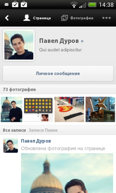
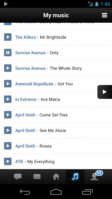
@grishka alright scrap the material 3 thing, we're going in a different direction 😉
|
5 comments
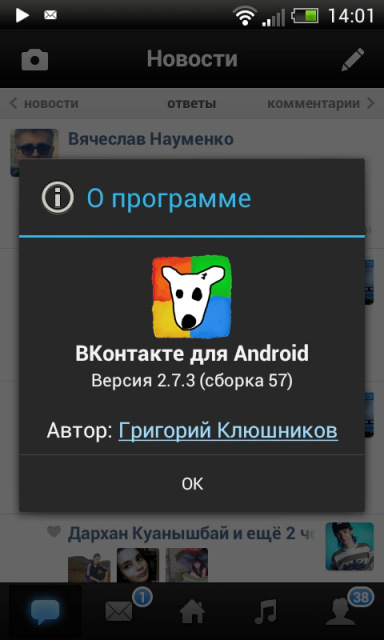
sam henri gold, this is what I was working on at the time. I absolutely hated this design because @grishka in fairness...droid sans is pretty ugly. but yeah i still have wartime flashbacks to the days of graphic slicing, writing specs for 9-part image layouts, and keeping a library of standard PNG icons at various sizes since no-one had system icon libraries yet. (shudders) sam henri gold, and the fun part was that I put a link to my profile in the about box |


@grishka i have a soft spot for pre-Holo Android when the official design guidance was "fuck it, do whatever you want"