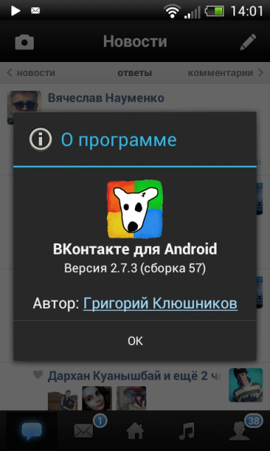
@grishka i have a soft spot for pre-Holo Android when the official design guidance was "fuck it, do whatever you want"
|
4 comments
@grishka in fairness...droid sans is pretty ugly. but yeah i still have wartime flashbacks to the days of graphic slicing, writing specs for 9-part image layouts, and keeping a library of standard PNG icons at various sizes since no-one had system icon libraries yet. (shudders) sam henri gold, and the fun part was that I put a link to my profile in the about box |


sam henri gold, this is what I was working on at the time. I absolutely hated this design because
- custom font, our designer didn't like droid sans
- every single icon and color had at least 2 states because everything got inverted in pressed state, akin to iOS 6
It was satisfying to strip this out and replace it with Holo. It took a lot of convincing to get Pavel on board with that redesign. I also had no fucking clue what I was doing so the code was so atrocious it's not even funny.