Made a new are.na channel https://www.are.na/sam-henri-gold/ui-that-fell-through-the-cracks
|
13 comments
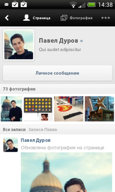
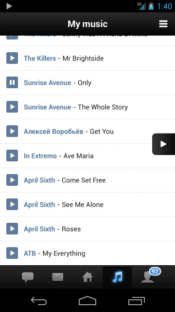
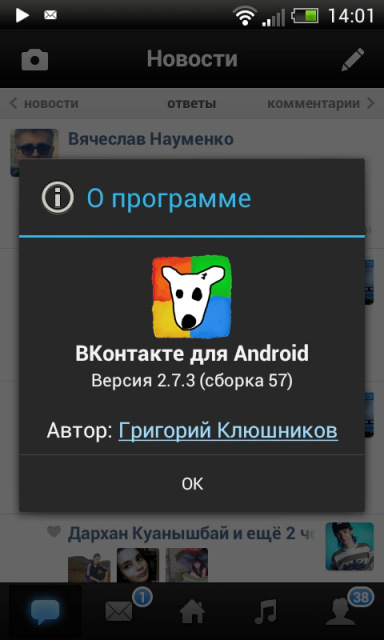
@thillsman I was curious how stage manager would interact with NSDrawer and I was not let down. All sorts of wacky @samhenrigold In Windows 11 when doing a search in Explorer there’s this little progress drop-down you can hit and all it does is show a 32x32 Windows-Vista-era spinner. I think about it every day. Android still comes with the 2.x black-grey-orange theme for backwards compatibility. You can still use it in an app. @grishka i have a soft spot for pre-Holo Android when the official design guidance was "fuck it, do whatever you want" sam henri gold, this is what I was working on at the time. I absolutely hated this design because @grishka in fairness...droid sans is pretty ugly. but yeah i still have wartime flashbacks to the days of graphic slicing, writing specs for 9-part image layouts, and keeping a library of standard PNG icons at various sizes since no-one had system icon libraries yet. (shudders) sam henri gold, and the fun part was that I put a link to my profile in the about box |


@samhenrigold This is very good.