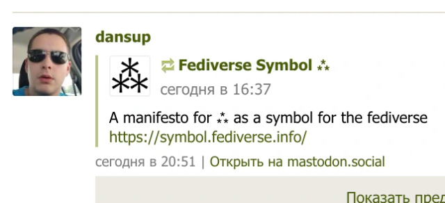
A manifesto for ⁂ as a symbol for the fediverse
https://symbol.fediverse.info/
|
122 comments
@FediverseSymbol Nice symbol. Do you also have a proposal to replace the term Fediverse? I know many people, me included, who don't want to or cannot use it as a term in political debates, myself included. Social Web was once one proposal, Open Socials is another. Maybe you've heard of other alternative naming that is more accessible in its name does not put the effort into a niche? @lunch@tilde.zone @raphael@post.lurk.org @yala@degrowth.social @FediverseSymbol@typo.social I assume it's that "fed", and "confederation", have specific connotations, at least in USA politics (not sure about if that even carries over elsewhere) @yala So we're supposed to rename something that already has a name because of some unspecified objection? @owlchemist @yala @FediverseSymbol what isn't "accessible" about the term Fediverse? We're not just going to change the name because you have some personal gripe with the term that you refuse to elaborate on. @yala @FediverseSymbol @ditol @yala @FediverseSymbol people especially in the US who hear it first time think it has something todo with „feds“ like „federal law enforcement“. Not everyone likes or likes to be associated with feds. I also read some people talking about feudalism, although this might be a bit far off. @B3r6ur @yala @FediverseSymbol @ditol @yala @FediverseSymbol I just explained it, I have 0 issues with it personally. Im against change anything here. The problem is, like other people said, if you are in political discussions in a somewhat global community. Some people may have bad thoughts about the term and/or might not understand the origin. Sure other words have the same problem. Also this is not an US only problem, people have coined the term internationally. @FediverseSymbol Strangely, you apparently don't mention it is an Unicode character, U+2042. #⁂ @efi Yes, it is sometimes used to separate paragraphs! But symbols can have multiple meanings. For instance @, 🍑, ✕… @FediverseSymbol i kinda wish the triangle were point-down - to represent anti-heirarchy / decentralization sorta , since pyramids tend to indicate heirarchy. @FediverseSymbol There are two pentagrams in Unicode, but they don't really show connectedness like the rainbow fediverse logo or this. Them not being circumscribed like the rainbow logo takes alot out of them. @Enalys @FediverseSymbol yeah, that was my initial reaction. They argue that it has limited usage since it is only an icon, not a symbol that can be spread everywhere, and using the aster-cluster could be a shorthand supported in Unicode almost anywhere @shadow06 Those are different concepts. The fediverse defines the ensemble of social networks linked by the protocol Activitypub. @FediverseSymbol@typo.social eh. I guess the real issue for the fediverse is there's no real functional logo that could be made for it @FediverseSymbol It looks like some Family Tree symbol or some Template of a chart in MS Office. Keep things they are please. Don't try too reinvent the wheel. @FediverseSymbol Please demonstrate how the pentagram doesn't scale down. Because I don't see how it would scale down in a worse way that the ⁂ symbol. @shoko @FediverseSymbol @FediverseSymbol I think as a symbol for the fediverse, the asterism is a little too minimalist. It's clearly meant more for places where images are impractical or impossible to use since it is way too bland and non-descriptive as a large symbol. I like the astronomical connection with the meaning but it's still a bit of a reach. I just don't see it being as useful as a custom-made icon.
"Joined Mar 27, 2024" uhh... Snowflakes, huh? Some sort of political commentary, or nah? Y'all are a little late to the party So we'll redo everything because ya'll just showed up with your "Manifesto"? Nope Nope nope nope nope @FediverseSymbol looks like the symbol for snow they use in weather forecast. Or the symbol for 3rd level of cold used on a fridge. I think trying to make that a symbol for fediverse is kinda like appropriating a common noun. Confusing at best, malicious at worst. @wolf480pl @FediverseSymbol My niece says, "It seems to represent a social media for snowflakes". @FediverseSymbol Just for completeness, I'll put the link to my post where I proposed a version of this asterism as a possible new logo / icon / symbol for the #Fediverse: https://fe.disroot.org/notice/Ag8qfjARJGHwZMK3Ae . The idea of using the asterism came from a discussion somewhere else (all is explained in the linked post).
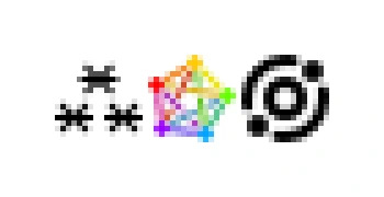
It's great that you've come to the same idea in a parallel path! 😊 @SocksPls Weird, I have the exact same config and I see it like this. Will investigate, thanks! @FediverseSymbol display dpi issue, I'd guess? are you on any high-dpi settings Kate (i ❤ blahaj) :unverified:, looks marginally better for me. I'm using macOS and the font is 11px Tahoma what do you think of the initiative @grishka? Would you agree that the pentagram symbol doesnt work at such small sizes with type? @grishka @FediverseSymbol I don't particularly hate the Meta symbol other then it feels pretty uncomfortable for them to come in and make up a new symbol with absolutely no conversation with "the community" and then other platforms like Flipboard start using it and it ends up feeling like encroachment. But I can also see how that can just come across as paranoia to some people. The ⁂ symbol does have the cool advantage that the :corporate_fediverse: symbol doesn't have which is Unicode Fediverse Symbol ⁂, ok so I've redrawn all three icons at 16x16, mostly quantized to the pixel grid. The top center asterisk is annoying because it has to be offset by half-pixel horizontally for the icon to be centered in its frame. The pentagram is somewhat more readable like this, but still something of a colorful pixel jumble. And to no one's surprise, the Meta's icon wins because it's so simple geometrically. @FediverseSymbol I'm impressed that my screenreader (correctly, apparently) reads this as "asterism"! That's a good accessibility point in its favor too. @F100 @trygvekalland 'therefore' is smooth dots like ∴, the asterism is three asterisk * together ⁂ @FediverseSymbol It looks to me like three cogs that should be happily spinning together but which have unfortunately got stuck. @FediverseSymbol honestly, reminds me too much of the Greendale Community College flag from the TV Show Community. @sfrazer434 Hahaha we do have three an…asterisks instead of one though, so we are much more pluribus. @FediverseSymbol I like this idea! I don't want to abandon the current symbol but I imagine they could coexist alright @FediverseSymbol @getalifemike my immediate thought was "a dinkus?" I had to look it up to see that they were distinct (but related) 😂 @geeksam @getalifemike Oh yes in a way the asterism is absolutely a variant of dinkus, simply one in a triangle layout :) The original usage is pretty much the same. @FediverseSymbol why not optimise the pentagom as a meaningfully named emoji design and submit it to the Unicode Consortium folks? It's worthy of a design project. https://www.unicode.org/emoji/proposals.html It's big enough to be taken seriously and would result in improved accessibility etc. @FediverseSymbol@typo.social Stars?? LIke Vib RIbbon?? Is this a vib-ribbon reference??????? @FediverseSymbol My microwave has one of those on a button already :D (This toot was meant to break the ice) @FediverseSymbol This is delightful! The asterism has been part of my personal mythos-symbology (is there a word for that?) for a while, with similar themes. This is a good motivator to write a blog post about that :) @FediverseSymbol I really like it! It actually looks a bit like the Chinese character 森, meaning forest. https://en.wiktionary.org/wiki/%E6%A3%AE @FediverseSymbol it's cold, sharp and inorganic. it has even a cube at it's center. the pentagram suffers from the same defect (but is slightly better because of the rainbow). that's why I prefer meta's symbol which does not represent a centralized network, but it represents one node and one connection. and thus represents the point of view of the user, not the system @FediverseSymbol There’s some nice ideas here! I’m still conceptually in love with the pentagram logo, but this is still miles better than the corporate goatse logo. @FediverseSymbol ⁂ is a good one. ❉ is a nice one too, but it kind of resembles ActivityPub more than the Fediverse itself. ⁂ U+2042: ASTERISM @FediverseSymbol I think it can be an addition instead of a replacement and use the both, one for icon and the other one for text, maybe could be a website like ⁂.com or ⁂.yourwebsite.com @FediverseSymbol I generally like the idea for a unicode symbol for the Fediverse, though I'd not replace the pentagram with it, but use both, depending on the use case. What I definitely don't like is this top down approach. "Hey, here is a new symbol for the Fediverse. Spread it!". Shouldn't this be a democratic process? @FediverseSymbol I feel like the colors in the default logo are important. For me it represent different instances with different purposes. Mastodon isn't just a cluster of servers talking to each other, it's the people using it - which is represented by colors nicely right now. |


@FediverseSymbol I like the old pentagram. :blobaww: