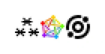
Fediverse Symbol ⁂, ok so I've redrawn all three icons at 16x16, mostly quantized to the pixel grid. The top center asterisk is annoying because it has to be offset by half-pixel horizontally for the icon to be centered in its frame. The pentagram is somewhat more readable like this, but still something of a colorful pixel jumble. And to no one's surprise, the Meta's icon wins because it's so simple geometrically.


@grishka Look at our favicon for our quick take at a sharp 16×16 version. We have a vector here: https://codeberg.org/fediverse-symbol/fediverse-symbol/src/branch/pages/img/favicon-vector.svg that reduces well at that size, as well as a hand-made pixel version there: https://codeberg.org/fediverse-symbol/fediverse-symbol/src/branch/pages/img/favicon-black.png (we have indeed a 1px offset, but in many use cases that’s not visible). Do like your solution of putting the asterisks 90°, there’s something there that could be explored more!
@grishka Look at our favicon for our quick take at a sharp 16×16 version. We have a vector here: https://codeberg.org/fediverse-symbol/fediverse-symbol/src/branch/pages/img/favicon-vector.svg that reduces well at that size, as well as a hand-made pixel version there: https://codeberg.org/fediverse-symbol/fediverse-symbol/src/branch/pages/img/favicon-black.png (we have indeed a 1px offset, but in many use cases that’s not visible). Do like your solution of putting the asterisks 90°, there’s something...