Email or username:

Password:

Forgot your password?
Top-level
Григорий Клюшников

Kate (i ❤ blahaj) :unverified:, looks marginally better for me. I'm using macOS and the font is 11px Tahoma

6 comments
Григорий Клюшников

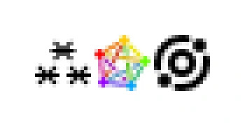
It does look gorgeous on a high-dpi display tho

Fediverse Symbol ⁂

what do you think of the initiative @grishka? Would you agree that the pentagram symbol doesnt work at such small sizes with type?

Григорий Клюшников

Fediverse Symbol ⁂, idk, I'm kinda torn between this and the Meta one.

In my mind, Meta's doesn't mean "centralized", it rather means that the bigger planet is your home server and the other ones orbit it. Mastodon and PeerTube introductory videos also make use of the planet metaphor to explain decentralization. As well as Threads, in the explainer when you turn on fediverse sharing.

But then a cluster of three asterisks, or stars, can also mean a constellation (of servers), so it also works.

The pentagram symbol doesn't work as is. But I'm also sure it can be drawn as pixel art at 16x16 to be legible. Naive downscaling rarely produces good results at these sizes. As an example, here's the Smithereen 16x16 favicon I drew pixel by pixel at that size:

Fediverse Symbol ⁂, idk, I'm kinda torn between this and the Meta one.

In my mind, Meta's doesn't mean "centralized", it rather means that the bigger planet is your home server and the other ones orbit it. Mastodon and PeerTube introductory videos also make use of the planet metaphor to explain decentralization. As well as Threads, in the explainer when you turn on fediverse sharing.

wakest ⛬

@grishka @FediverseSymbol I don't particularly hate the Meta symbol other then it feels pretty uncomfortable for them to come in and make up a new symbol with absolutely no conversation with "the community" and then other platforms like Flipboard start using it and it ends up feeling like encroachment. But I can also see how that can just come across as paranoia to some people. The ⁂ symbol does have the cool advantage that the :corporate_fediverse: symbol doesn't have which is Unicode

Григорий Клюшников

Fediverse Symbol ⁂, ok so I've redrawn all three icons at 16x16, mostly quantized to the pixel grid. The top center asterisk is annoying because it has to be offset by half-pixel horizontally for the icon to be centered in its frame. The pentagram is somewhat more readable like this, but still something of a colorful pixel jumble. And to no one's surprise, the Meta's icon wins because it's so simple geometrically.

Fediverse Symbol ⁂

@grishka Look at our favicon for our quick take at a sharp 16×16 version. We have a vector here: codeberg.org/fediverse-symbol/ that reduces well at that size, as well as a hand-made pixel version there: codeberg.org/fediverse-symbol/ (we have indeed a 1px offset, but in many use cases that’s not visible). Do like your solution of putting the asterisks 90°, there’s something there that could be explored more!

@grishka Look at our favicon for our quick take at a sharp 16×16 version. We have a vector here: codeberg.org/fediverse-symbol/ that reduces well at that size, as well as a hand-made pixel version there: codeberg.org/fediverse-symbol/ (we have indeed a 1px offset, but in many use cases that’s not visible). Do like your solution of putting the asterisks 90°, there’s something...

Go Up