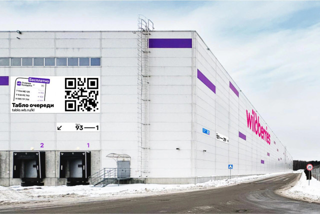
Check out a new large project: wayfinding for suppliers of Wildberries, the largest Russian online retailer —
https://ilyabirman.net/wb/suppliers/
|
This profile might be incomplete.
Open on mastodon.social Ilya Birman
Wall 117 posts
Here’s a video of my February talk at the Transit Mapping Symposium in Abu Dhabi. I was talking about my maps of course: Our Tashkent metro map was updated and has become an official map: Originally designed by Timur Repin and myself. The new version also used some input from Yulia Cherevataya and Alibek Musabekov. Come to us for more map design. This is how Figma messes things up with its UI3. They say more space is available for content. It’s not only false, the exact opposite is true. In addition, there is constant noisy flicker in the gaps on the sides. Bad UI from literally every point of view. @ilyabirman I remember people also refused to believe that dynamic island actually takes more space than notch, not less. Perception ¯\_(ツ)_/¯ I have finished the largest part of my book “Designing Transit Maps” — it’s out now. Three new chapters of the part Details, ‘Symbols’, ‘The city’, and ‘Excellence’, have been released. Check it out: https://bureau.ru/news/2024/book-metro-details-en/ My book “Designing Transit Maps” has just been updated with a new superchapter, ‘Labels’: @siracusa, on CarPlay and branding. Your perception is skewed by you being car enthusiasts, which most people I don’t think are (?) You are saying “I want my car brand”, but no, of course I don’t! Car brands suck in graphic design, they cannot design the simplest screen well. No, I don’t buy a car for its car branding, I buy it for its ability to get me from point A to point B. The least I can touch the car brand in this process the better. The car doesn’t support CarPlay? Sorry, not interested. My book “Designing Transit Maps” has just been updated with new chapters: ‘Transfers’, ‘Directions’, and ‘Fare zones’: My book “Designing Transit Maps” has just been updated with new chaptes: Stops and Terminals: A new reader’s review of my book Designing Transit Maps is published. Read all of them and buy the book: My book “Designing Transit Maps” has just been updated with new chaptes: Lines, Bundles, and Bends: Check out our new Metro map for Tashkent, Uzbekistan: @ilyabirman This is really cool. I like how it works with the city's shape and architecture, makes it more relatable than the usual straight lines. Reversibility is a property of an interface input control, where the user can return the control to its initial state at any time. Or, more generally, where the user can freely switch between all available states. Detail and examples: My book “Designing Transit Maps” has just been updated with new content. Three parts out of five are now out, go read them: Quote: @siracusa in the 446th episode of ATP talks about how kids become programmers and how it didn’t work with his kids, starting at 40:36: @siracusa, have you seen that iOS 17 adds a Sync Now button to iCloud Photos? Unbelievable! How I stopped using Duolingo Duolingo used to be a great app. I opened in to practice almost every day. But then they changed the design: Often when we open an application, we see a screen that tells us about it or about some recently added features. The screen may consist of several pages that you have to flip through one by one. There may be a button to skip it all and go to the main interface of the application. This is commonly referred to as an onboarding screen. It is bad practice to do so. A long read in my blog: @ilyabirman You missed the important thing I think: most of the onboarding screens try to sell me a subscription. Adv pushes paid features to the user @ilyabirman I bet everyone would agree that onboarding screens are flawed as a concept, but it’s the only one that could be universally (as a pattern) applied to any app? |


