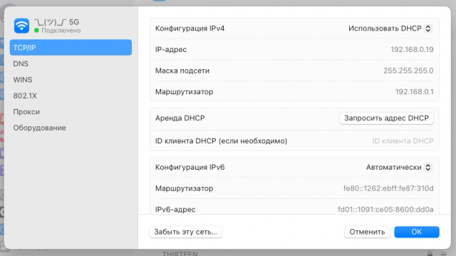
The world desperately needs more textures in UIs.
|
3 comments
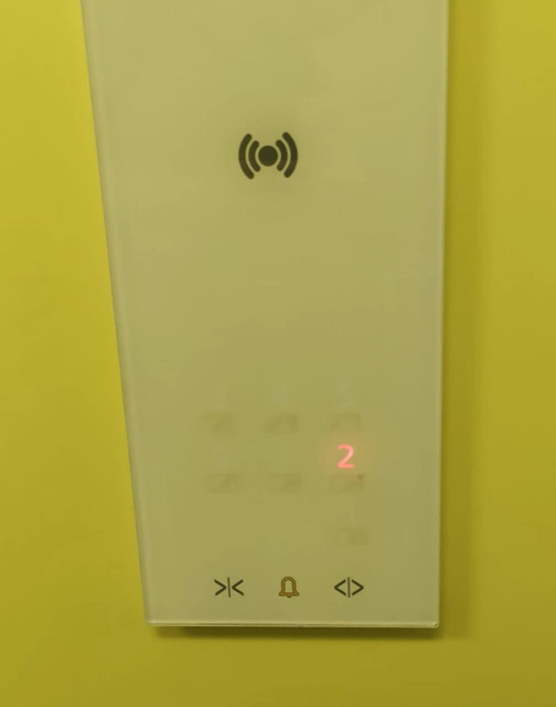
sam henri gold, the only two cases when IRL buttons don't look like buttons is these flat film membrane buttons on things like microwaves, and this stupid elevator control panel: |


@grishka I agree there ought to be more whimsy in UI, but it’s a constant balancing act to meld a “special moment” that can use stylized design and creating something that can be easily turned into a design system.
Airbnb does a good job at this, though the areas they choose to “spice up” seem pretty arbitrary (the month duration input wheel and the host book unfold animation)