Email or username:

Password:

Forgot your password?
sam henri gold

Journals in the iPhoto iPad app were a wild, beautiful, fleeting moment in time. I feel for the designer who probably spent a ton of time on the cloth stitch texture only to rip it out for iOS 7 after, like, nine months.

6 comments
Григорий Клюшников

The world desperately needs more textures in UIs.

sam henri gold

@grishka I agree there ought to be more whimsy in UI, but it’s a constant balancing act to meld a “special moment” that can use stylized design and creating something that can be easily turned into a design system.

Airbnb does a good job at this, though the areas they choose to “spice up” seem pretty arbitrary (the month duration input wheel and the host book unfold animation)

Григорий Клюшников

sam henri gold, the problem that textures, shadows, and gradients solve IMO is affordances. Helping the user subconsciously figure out what controls do. Most IRL buttons look like buttons, they stick out and you know you can push one when you see it. Switches look like they can be toggled. Dials look like they can be grabbed and rotated.

But in modern UIs everything looks the same. Buttons don't "stick out", you have to try interacting with the thing to see what it does. Everything is overly abstract. Non-technical people constantly need help with this stuff. And, yes, most IRL objects have *some* texture to them. They also cast shadows (thank god this part is back) and reflect light (but this is largely ignored for some reason).

The text on the right is actually a text input. You only find this out when you hover it because the cursor changes to the "I" thing.

p.s. wow, airbnb now finally has a toggle to show the total price? Too bad they lost me as a client because of the million fees for a much worse experience compared to hotels.

sam henri gold, the problem that textures, shadows, and gradients solve IMO is affordances. Helping the user subconsciously figure out what controls do. Most IRL buttons look like buttons, they stick out and you know you can push one when you see it. Switches look like they can be toggled. Dials look like they can be grabbed and rotated.

Григорий Клюшников

sam henri gold, the only two cases when IRL buttons don't look like buttons is these flat film membrane buttons on things like microwaves, and this stupid elevator control panel:

Keir

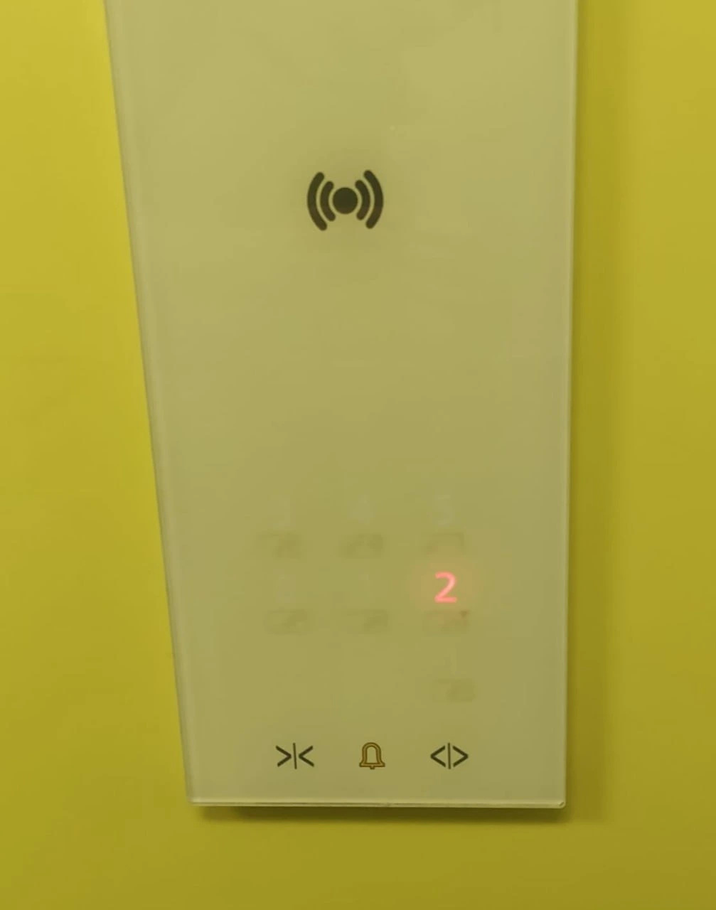
@samhenrigold this was great and there is still no good alternative to this even now which blows my mind somewhat!
A way to collate photos alongside other information related to a holiday like this is a great idea

Go Up