|
4 comments
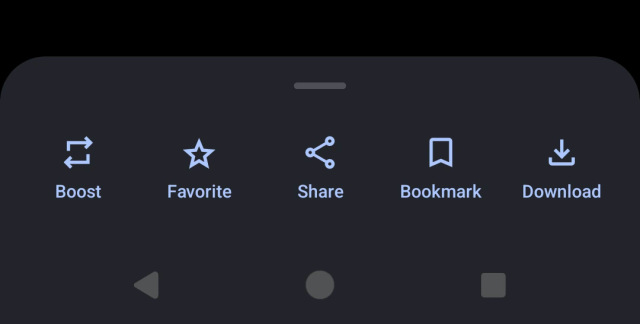
The sheet on the second screenshot should probably be titled just "Options". "Share to -> Share" is confusing, "Share to -> Block" even more so. It would also work better if you make these options icon-with-label buttons like these: |


@dansup great work,
looking forward to trying the beta :)