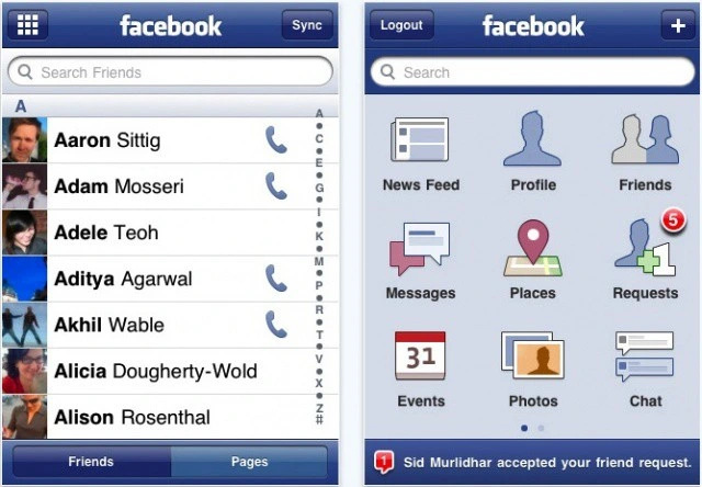
I've been designing with Material You for the past few months and something I noticed when switching back to iOS is how your accent color is relatively limited in scope: labels, background/foreground fills are always tinted blue.
“Color grading” your app should be easier. If your app is green, why should the background be off-blue? Why are labels pure black when they can be infused with a bit of color?
Additional reading:
[1] https://threadreaderapp.com/thread/1502318105124646924.html
[2] https://ianstormtaylor.com/design-tip-never-use-black/ by @ian


It's extremely subtle but it's a wonderful bit of polish.