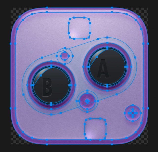
No one ever dives into asking about color or commenting on how to handle translucent objects when you can’t rely on blend modes. No one asks about inspiration or talks about how I get from idea to final execution. How to make ICNS files? Or what the difference between two different 512x512 assets are. I’ve basically never heard anyone ask me about recoloring icons and which method works best.
It’s always a surface-level response. I don’t know how to change that. Or if I can.


@louie Hey, it would actually be super nice to see some process :) Earlier iterations of an icon, sketches if you have, or even just an outline view of the final?
Maybe posts like that could invite more reactions of the kind you wish you had, and also remind people (besides designers) that there is actually a lot of work behind these, and would be very interesting to see anyway, process posts are always fun!