Email or username:

Password:

Forgot your password?
sam henri gold

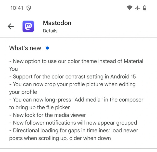
We just put out a big update for the Mastodon Android app! A lot of this was based on feedback from Play Store reviews. Give it a shot, it's a really strong update.

9 comments
Kalle Kniivilä

@samhenrigold Sounds nice, might test, but I'm missing an important feature here: reverse timeline. That is, timeline in real chronological order. As far as I can see the only Android app offering this at the moment is @pachli

sam henri gold

@kallekn meaning the first post is at the bottom?

Kalle Kniivilä

@samhenrigold The last, newest post is at the bottom. For us who like to read stuff in natural chronological order and not backwards. Some Twitter clients had this feature, and at least one of the iOS Mastodon clients. And #pachli .

sam henri gold

@kallekn I wouldn't hold your breath for this, I don't think we're likely to implement this.

The default state for Mastodon (and virtually every list interface in UI design) is to have it scrolled to the top. And when the oldest, stalest post is at the top by default, there's not much value in seeing the same post at the top every single time you re-launch the app. It also just introduces a ton of weirdness around our infinite scrolling mechanisms, timeline positions, etc.

Kalle Kniivilä

@samhenrigold For me, the default state is to have it scrolled to where I last was. Even if I relaunch the app. Works reasonably well in @pachli , I'm happy to report.

:-)

mosttoast

@samhenrigold Hi Sam,
I have two questions/complaints.
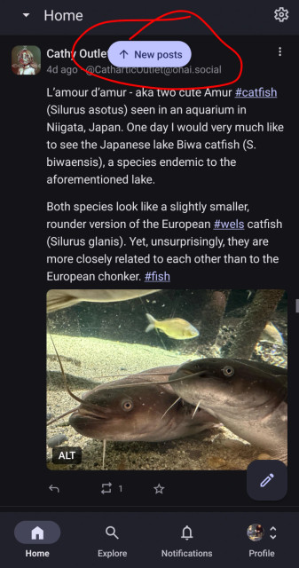
the first is that I can't turn off the 'new posts' button (screenshot attached) which feels ro me like something stuck on the screen. I don't find it helpful or desirable to know there are new posts when i'm intentionally scrolling backwards in time.

second, I don't know how to view the public timeline. this is fairly easy on Tusky, Pixelfed, and Pixeldroid among others. am I missing something or is it not included? Android - v2.8.0 (125)

@samhenrigold Hi Sam,
I have two questions/complaints.
the first is that I can't turn off the 'new posts' button (screenshot attached) which feels ro me like something stuck on the screen. I don't find it helpful or desirable to know there are new posts when i'm intentionally scrolling backwards in time.

sam henri gold

@mosttoast
1. You can swipe it up to dismiss it. There's not a way to permanently dismiss it
2. We don't offer the public (federated) timeline in any of our client apps. We think it's noisy with very little signal and, in our testing, really freaked out new users. Since the goal of this app is to make Mastodon as accessible as possible, it was an intentional omission.

Go Up