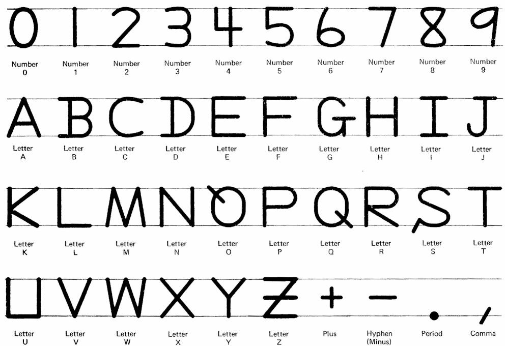
In 1974, ANSI published the Standard character set for handprinting (ANSI X3.45-1974). It proposed a uniform method of #handwriting acceptable to optical character recognition technology of the day. It included only upper case letters.
It had some quirks: letter O has a tail at the top, like Q rotated 90 degrees. S has a little tail at the bottom left. U has a square base. Z has a full-width bar at mid level.
Interesting,no slashed zero - which was commonly told over here - would have avoided that strange O. Also the horizontal bared Z is as well standard. Last but not least the 7 being as well bared. helps to distinguish from ones and slopy I and T.

@scruss This feels very similar to the old OCR-A typeface that cash registers used to scan before barcodes were a thing. https://en.wikipedia.org/wiki/OCR-A
@scruss
Interesting,no slashed zero - which was commonly told over here - would have avoided that strange O. Also the horizontal bared Z is as well standard. Last but not least the 7 being as well bared. helps to distinguish from ones and slopy I and T.
@scruss I would confuse 0 and O nonstop. I am used to a strike through with a zero and the tail at the O would be interpreted as such.