|
33 posts total
12
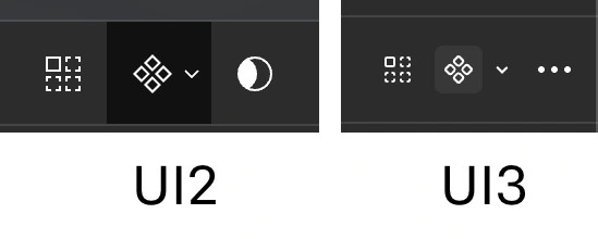
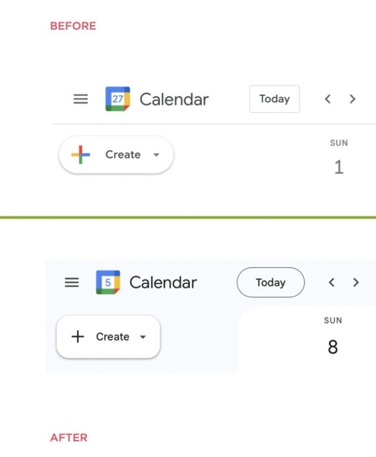
Redesign rule #1: if you have no good ideas, you can always make round buttons square and square buttons round Picture from https://twitter.com/@LukeW This is not a video player. This is starship control panel Thanks @grishka for the picture Don’t force customers to watch a cartoon before they can interact with the website. Especially returning customers who’ve seen the very same cartoon hundred times already As I understand it, quality control is basically non-existent at Apple these days For a while, we thought they just don’t care about Macs, but iPhones still should be okay? Well, they aren’t anymore. Here’s the checkbox. But we won’t let you press it. Thanks @hanser for reporting this Today’s useless feature by a multi-billion corporation: Apple Photos will change (i) icon based on the approximate content of the photo. Not sure why, the menu stays the same and just shows you meta-info on the camera (lens, focal distance, date, place etc) Probably took a lot of effort, but thanks, Apple, I can see it’s cat by looking at the photo. WHAT. YOUR. APP. DOES. IS. MORE. IMPORTANT. THAN. POPUPS. Reported by Efe and one other person Animating _content_ in makes no sense. I came to look at content, just show it to me as soon as it’s available. @grumpy_website Literally so insulting when websites do this shit. It's like if the person who thought this was a good idea had a blindfold that you need to put on before showing you each item you wanna see so they can do a big wow reveal and you can clap at each one lol. @grumpy_website At first I thought only the images would be lazy-loaded and then faded in after they finished loading. But all texts are also doing that, so I suppose this was an explicit decision to animate all content … Another example of false correlation. It feels like slider controls days but in fact it’s completely independent Content: fits on one screen Modern engagement-driven services are crazy @grumpy_website That can't be right. No one in their right mind would do something like that. It's inhumane. Menu on hover: bad idea. User should have a freedom of moving their mouse without fear of triggering anything. It’s a basic human right. Jira’s constant struggle to fit less and less fields in a form. From left to right: - Jira 8: 11 fields Thanks Gamlor for the pictures Can one put EVERY possible control on one screen? Yandex says — YES! - Toggle ... Color icon with grey backbground I don’t even know how to tag this post Thanks @apust for the picture 12
|


