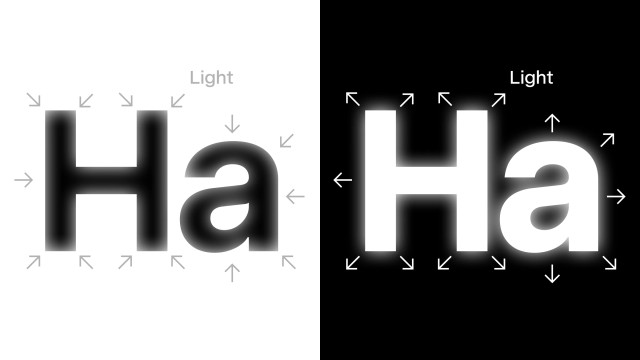
@sudo_whoami Here’s a way to think about it: Our displays are essentially millions of tiny light bulbs that emit light, creating a glow. This glow visually “bleeds” into the surrounding dark areas.
As a result, a black line on a white background appears thinner to our eyes compared to a white line of the same thickness on a black background.
That’s why it makes sense to compensate for this effect when designing text.


