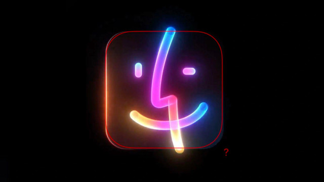
I can’t be the only one that noticed this Finder icon’s corner radius is weirdly not the regular app icon radius
|
8 comments
@sdw wish that was the only inconsistency in Apple’s latest design. Their designs aren’t as polished as they used to be. Sure, they’re still on a different level compared to most companies, but if any company can be called design-driven these days, it’s Airbnb or Linear. or maybe we designers got spoiled 😅 |


@sdw spooky season! 😱